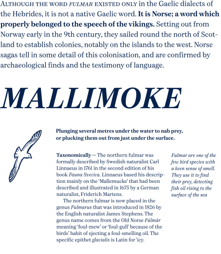
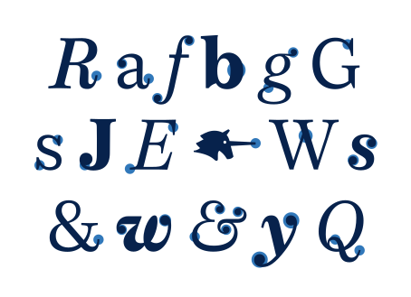
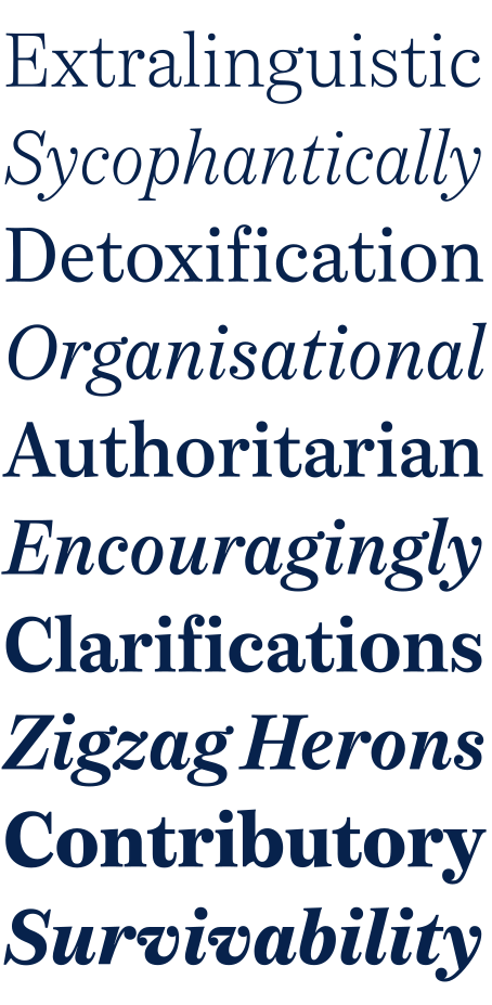
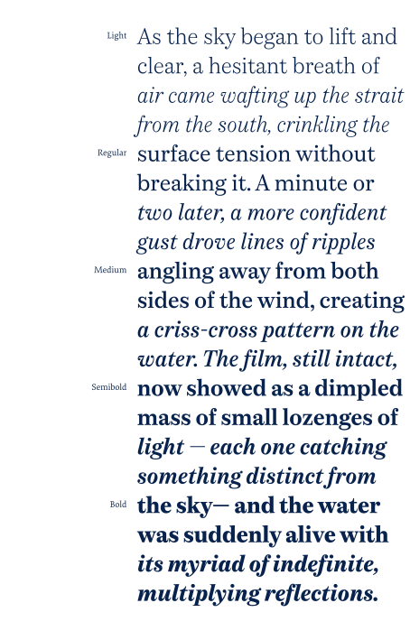
Fulmar revisits and refreshes the Scotch Roman. In a genre that can feel square, fussy or strangely American, Fulmar returns to Scottish typographic sources and forges an alliance with French experiments in rational design. The result is crisp yet warm, steadfast yet lively, sharp yet robust, rational but humane.
I talked about its development here.
Fulmar was the starting point for Iris Serif 1961, introduced as part of a European Design Awards nominated redesign of Iris Ceramica discussed here.
© Leo Philp 2026.
All rights reserved.