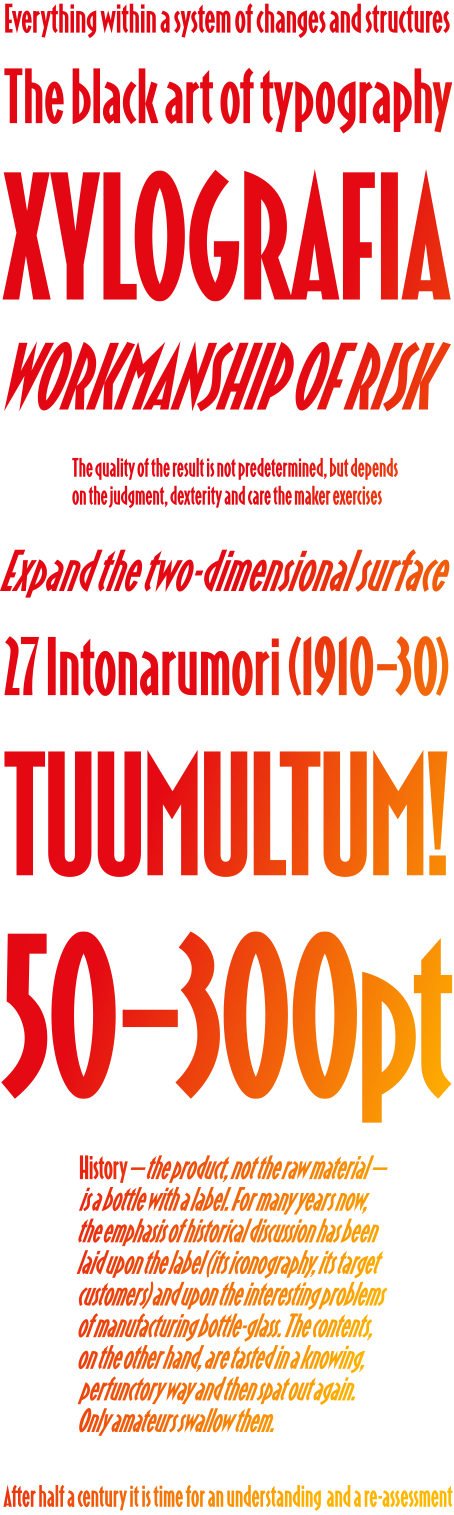
Tirana is a condensed geometric sans with caps and lowercase. It is rich in colour, with a geometric flavour and sharp details. It has a large x-height, low contrast, and very open apertures. Some of the letterforms come from classic modernist lettering, such as the exceedingly open C and S, or the pointed A and N. However, the design is defined by its treatment of spurs and joints, which are either squared or closed at a sharp angle, and its lenticular and lemon-slice counters.
Tirana was released as part of the Alfabeti Modernisti collection. Based on research by Luca Lattuga, the collection revived and updated Italian modernist wood and metal types from the 1930s–1940s. You can see them here.
© Leo Philp 2026.
All rights reserved.