Leo Philp
Leo Philp is a type designer and educator working in Scotland.
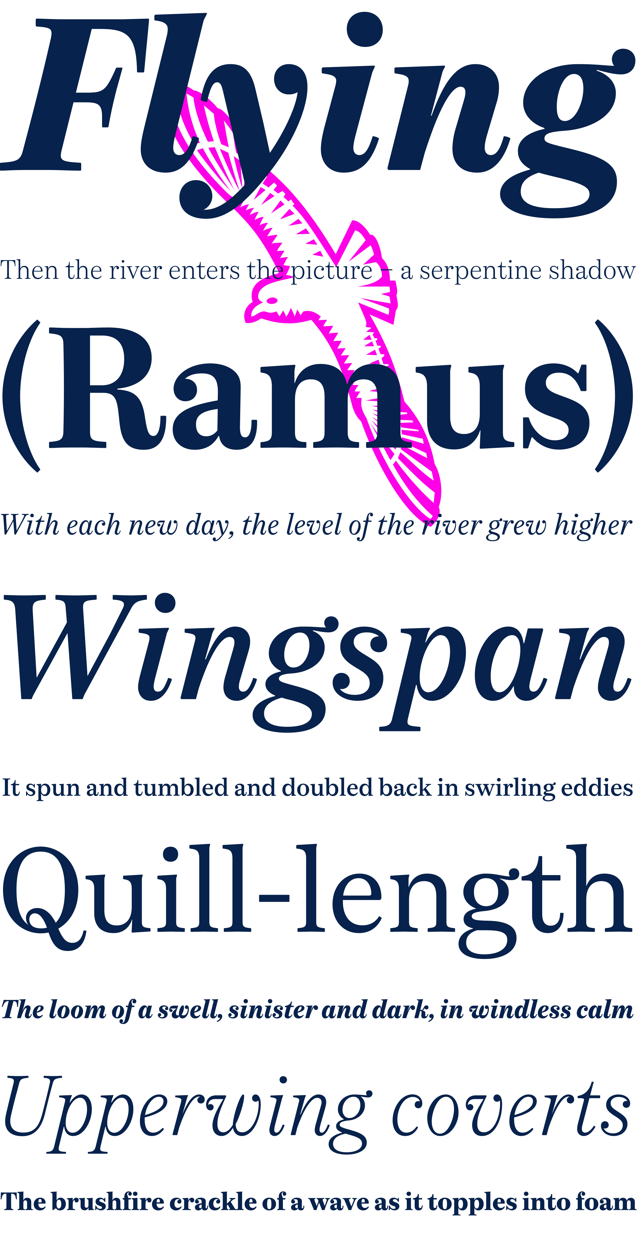
More European than American, Fulmar draws on a range of influences from around the North Sea, from Fife’s Alexander Wilson to 17th-century French experiments in modulation and 18th-century Belgian flash, and combines them with contemporary structure and proportions. The result is crisp yet warm, steadfast yet lively, sharp yet robust, rational but humane.
I talked about its development here.
In 2022, Fulmar was Germany's seabird of the year.
A contribution to the Alfabeti Modernisti project: AM Tirana
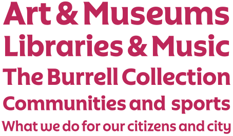
Glasgow Life
A brush influenced geometric for Glasgow's cultural and sport organisation
A custom typeface for the National Trust for Scotland
A dignified and capable English grot with bounce between its cases
A warm interpretation of the types of Oz Cooper
A clean but quirky sans serif for an alma mater: the University of Dundee
A trio of tricksy display types for the shirts of an American football league
Two condensed sans for the equalities charity Stonewall
© Leo Philp 2026.
All rights reserved.